Justification
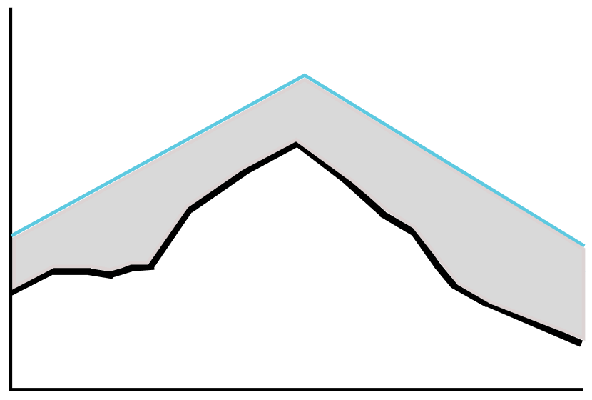
- Accessible visuals shouldn’t be complicated (Nussbaumer Knaflic, 2015). To make this graph more accessible and less complicated for the patient, I removed the additional quantitative data from the first iteration.
- A soft color palette with color used sparingly creates a calming visual design (Lonsdale, 2023).
Iteration 1
Iteration 2
Accessible view
Iteration 1
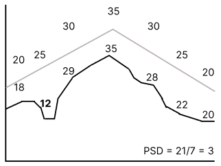
The visible labelled values are listed from left to right in the chart.
| Line | Values from left to right |
|---|---|
| Gray line | 20, 25, 30, 35, 30, 25, 20 |
| Black line | 18, 12, 29, 35, 28, 22, 20 |
Use horizontal scrolling to view the complete values table.
Calculation: PSD = 21/7 = 3
Iteration 2
A simplified range design: a black line is shown within a soft gray filled area bounded by a cyan contour line. The graph has no numerical labels.