Sketches
Accessible view
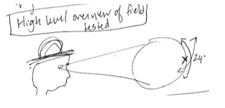
The first sketch is labelled “High level overview of visual field tested.” It shows a side profile looking toward a circular target. Two sight lines form a cone from the eye to the target, marked 24°.
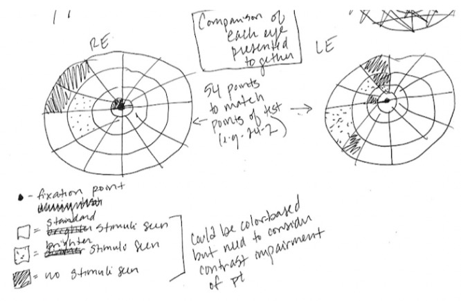
The second sketch compares the two eyes: two circular field grids are labelled “RE” and “LE,” with an arrow between them. Shaded and dotted sectors mark different stimulus results around the field, and a central mark indicates the fixation point. The handwritten note explains that the regions could be coloured but that contrast impairment of the patient must be considered.
A handwritten legend identifies the fixation point, stimulus marks, and “no stimulus seen.”
Attempting to reimaging the greyscale diagram.
Version 1
Accessible view
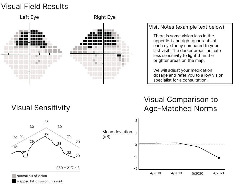
The graphic is headed “Visual Field Results.” The upper section has maps labelled “Left Eye” and “Right Eye.” Both maps use a grid of square sensitivity values with a central horizontal and vertical axis; darker squares occupy the upper field areas, with a particularly dark cluster in the upper-left area of the left-eye map and the upper-right area of the right-eye map.
The upper-right text box is headed “Visit Notes (example text below).” It reads: “There is some vision loss in the upper left and right quadrants of each eye today compared to your last visit. The darker areas indicate less sensitivity to light than the brighter areas on the map.” It then says: “We will adjust your medication dosage and refer you to a low vision specialist for a consultation.”
The lower-left chart is labelled “Visual Sensitivity.” A grey “Normal hill of vision” rises to 35 and then descends; the black “Mapped hill of vision this visit” is irregular, with visible labels 18, 12, 29, 35, 28, 22, and 20. The chart also shows “PSD = 21/7 = 3.”
The lower-right chart is labelled “Visual Comparison to Age-Matched Norms” and “Mean deviation (dB).” Its x-axis labels are 4/2018, 4/2019, 5/2020, and 4/2021; the plotted values are near zero for the first two dates, lower at 5/2020, and lowest at 4/2021.
Too much irrelevant detail for the patient.
Version 2
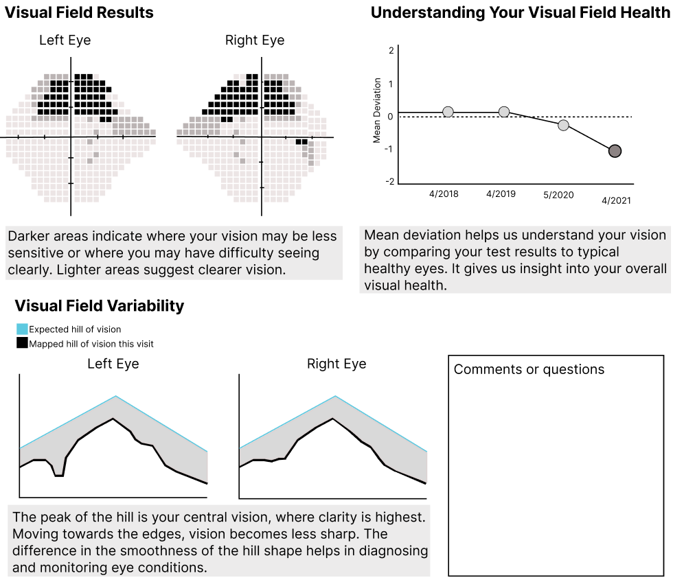
Accessible view
This refined layout is headed “Visual Field Results.” The upper section presents two square-grid field maps labelled “Left Eye” and “Right Eye,” with central fixation axes and darker regions showing the areas of reduced sensitivity. A short explanatory note sits beneath the maps.
At upper right, “Understanding Your Visual Field Results” introduces a small comparison chart. Its plotted profile descends from the higher left side toward the lower right, alongside a horizontal reference line, so the change across the sequence is visible rather than presented as a single number.
The lower section is labelled “Visual Field Variability.” Two hill-of-vision profiles, one for each eye, use filled light and dark areas and overlaid outlines to show the shape and variation of the measured field. The profiles have several rises and falls rather than a flat line; the two eye panels are placed side by side for comparison.
A boxed area at lower right is labelled “Comments or questions.” Explanatory copy remains alongside the maps and charts, while this box provides space for patient-specific comments.
More thoughtfully designed and written for the patient.