Justification
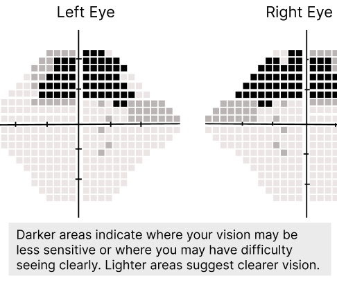
- Supporting text can aid the user's comprehension and make the visualization more accessible (Lonsdale, 2023). I added relevant educational content about the chart to the second iteration so the patient could easily reference it beyond the visit.
- The text and related images are positioned closely together to make related information quickly identifiable (Lonsdale, 2023).
Iteration 1
Iteration 2
Accessible view
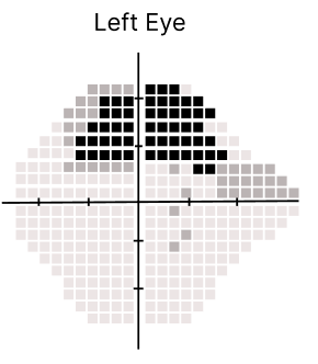
The visual-field plots use square cells arranged around horizontal and vertical crosshair axes. Darker cells are concentrated in the upper portions around the central axes, while lighter cells extend below and toward the outer portions of the fields. The plots show spatial patterns rather than exact values.
Iteration 1 shows one plot for the Left Eye. Iteration 2 shows a Left Eye plot and a Right Eye plot together, allowing the left-eye presentation to be compared with the right-eye presentation and with Iteration 1. The two Iteration 2 plots retain the same spatial visual language while showing the eye-specific patterns.
The explanatory text in Iteration 2 states: “Darker areas indicate where your vision may be less sensitive or where you may have difficulty seeing clearly. Lighter areas suggest clearer vision.”